Hertz
Project Type
Mobile App Case Study
Services
Research
UI/UX Design
Competitive Analysis
Wireframing
Prototyping
Credits
Kelly Marion
car rental mobile appI completed the IBM Recruiting Design Challenge during my interview process in February 2020. The challenge was to update the Hertz mobile application and included the following constraints:
The project was given with short notice and scarce supplemental detail and research.
I was expected to spend no more than 4 hours on this design challenge.
The project was to be presented during a 60-minute session with the interviewing panel.
View clickable prototype here.

PROBLEM STATEMENT
Design a better way for a mid-career professional who occasionally travels for work to find just the right vehicle when using the hertz mobile app.
Research
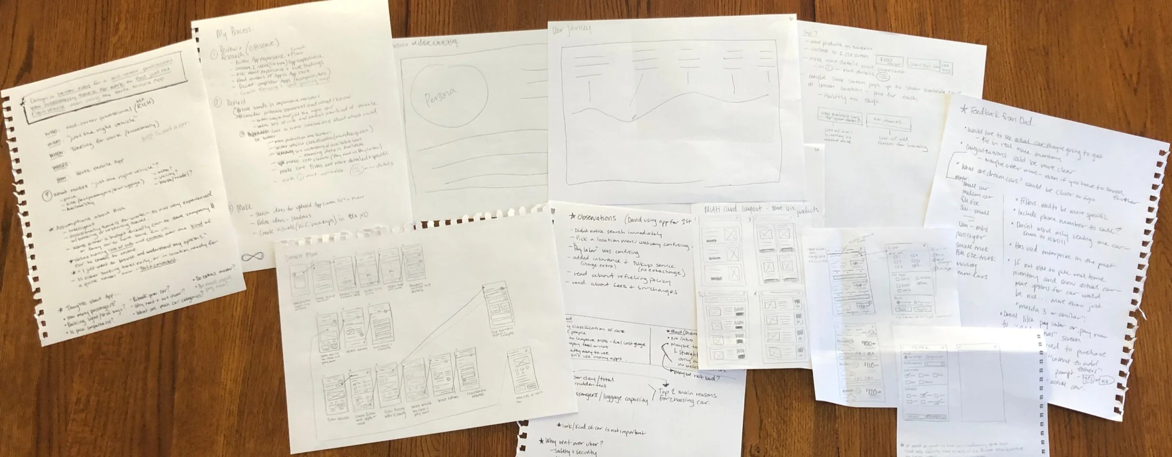
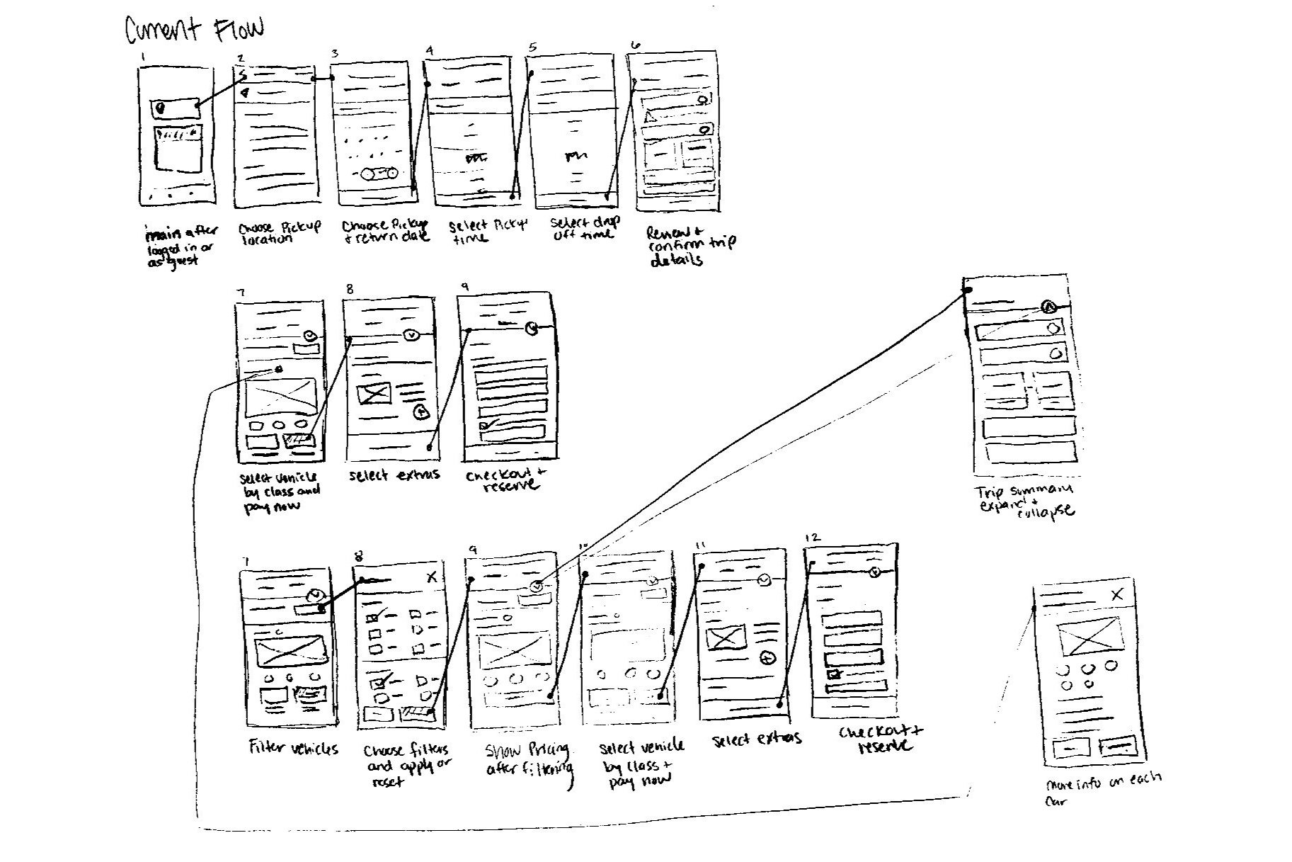
Downloaded app - reviewed experience and flow
Read app reviews in Apple app store
Observed two users’ app experience (first time using)
Asked users about experience and noted findings
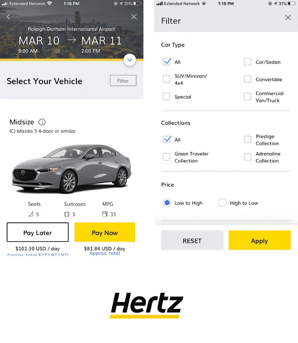
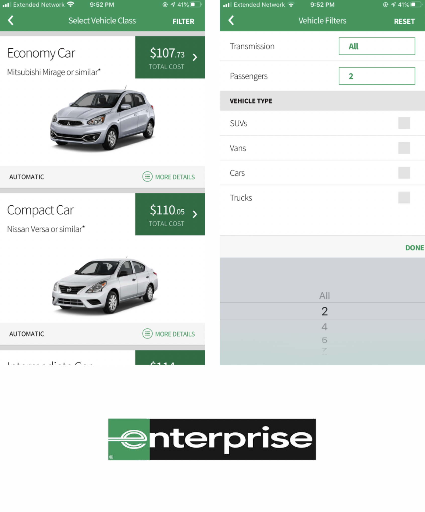
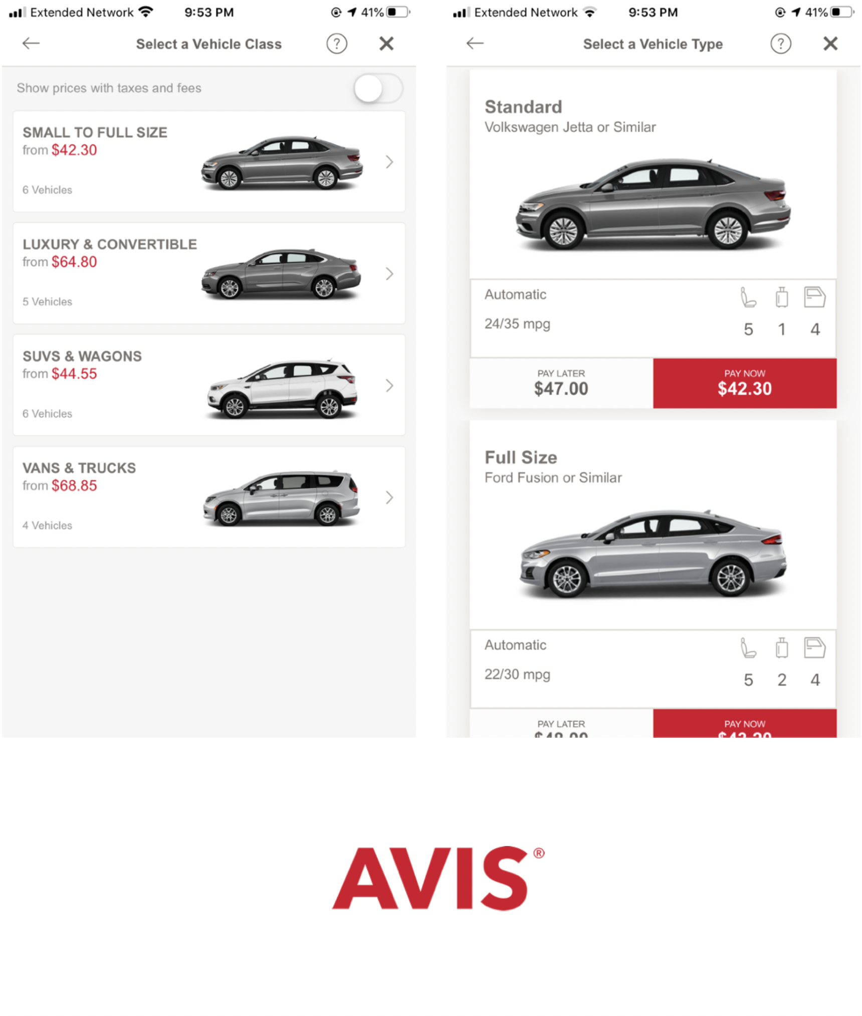
Downloaded and reviewed competitor apps (Enterprise & Avis)
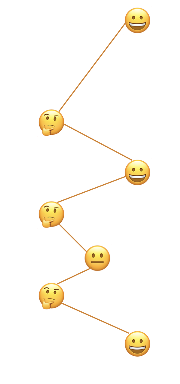
Created persona and user journey example

PositivesEasy to find information on number of passengers, luggage capacity, and miles per gallon
Colors and visual aesthetic of design
Simplicity of interface
NegativesLocation search was difficult to find for users
Significant amount of in-app scrolling
Difficulty viewing multiple vehicles at a time
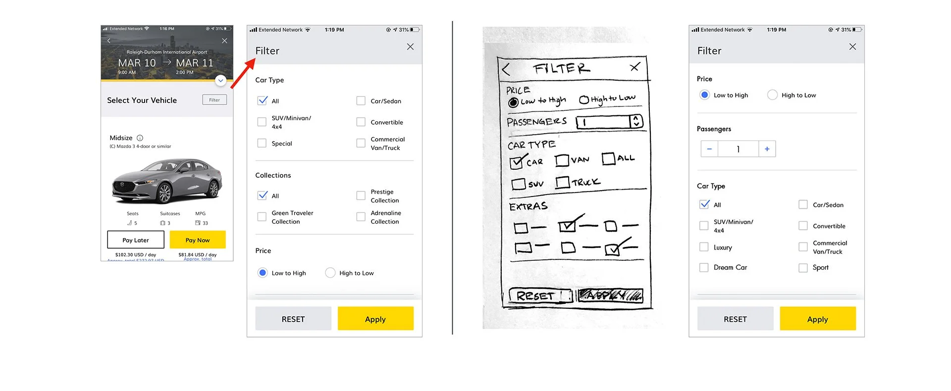
Filters are too vague
"Pay Now” vs. “Pay Later” buttons can be confusing for users
Cost of rental not prominent
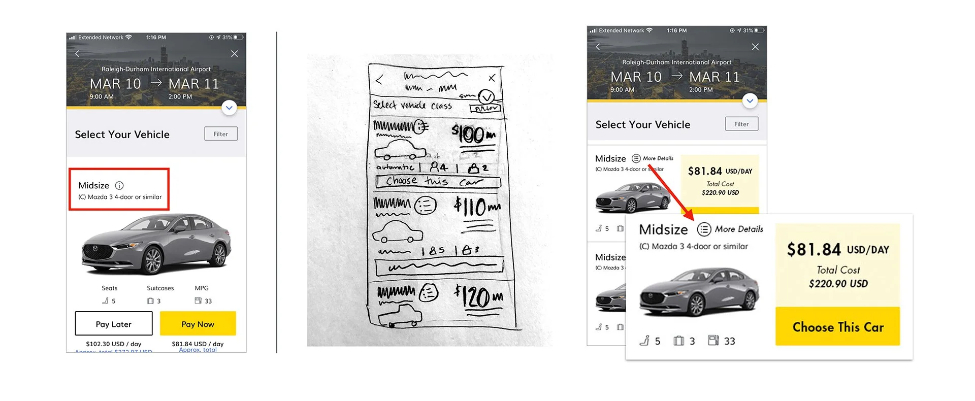
More information icon is small and hidden
Know the actual car they will be driving was not clear

What is “just the right vehicle?”
Choosing the right vehicle when using a car rental application can be a daunting task. Luckily, with the help of filters, users can easily find a car that meets their specific needs. Whether they're in search of a budget-friendly option, a spacious vehicle for a family vacation, or a high-performance car for a special occasion, the right set of filters can save users valuable time and ensure that they find the perfect car for their next adventure.
The most effective categories for filtering options include:Price
Size (passengers & luggage)
Availability
MPG
Utility
Make/Model
Transmission
Extras
Book previous rental
Ideal car
Safety
Visual App
Experience
and Flow

Competitor App Review

Persona
Meet Regina. Regina is a 42 year old engineer based in Grand Rapids, Michigan. She lives with her husband and two children. She occasionally travels for work, which she enjoys. Regina is pretty comfortable using computers and mobile devices to perform many different types of tasks. As an Engineer, she expects these interactions to be functional and seamless. Regina appreciates good, clean design. She doesn’t have a lot of free time after spending her days at work and her evenings and weekends with her family.
This particular user type values having lots of information and control over the kind of car they ultimately choose to reserve.
There is frequent and pervasive evidence of sentiment from all user types around the theme of, “I just want to browse and understand my options.”
Regina's manager tells her that she needs to book a car for travel next week.
Regina opens the Hertz app on her way home.
She logs into the app and chooses her drop-off/pick-up location, dates, time, and then confirms her trip details.
Regina is worried about renting a car that will fit all four of her colleagues.
Using the filters, she drills down to the rental offerings that meet her needs.
She is happy to find a full size SUV and is ready to book it.
The “Pay Now” vs “Pay Later” buttons are a bit confusing - she is looking for a “choose this car” option but doesn't see it.
After some confusion, she selects “Pay Now” and looks to enter her company card.
She’s presented with a screen for extras like insurance, but decides to continue without adding as her company is insured.
She reserves the vehicle and is happy to be prepared for next week.
Hopefully, the car that she believes she reserved is the one that she receives.
User Journey

More information icon is small and hidden
Filters are too vague
Significant amount of in-app scrolling difficulty viewing multiple vehicles at a time
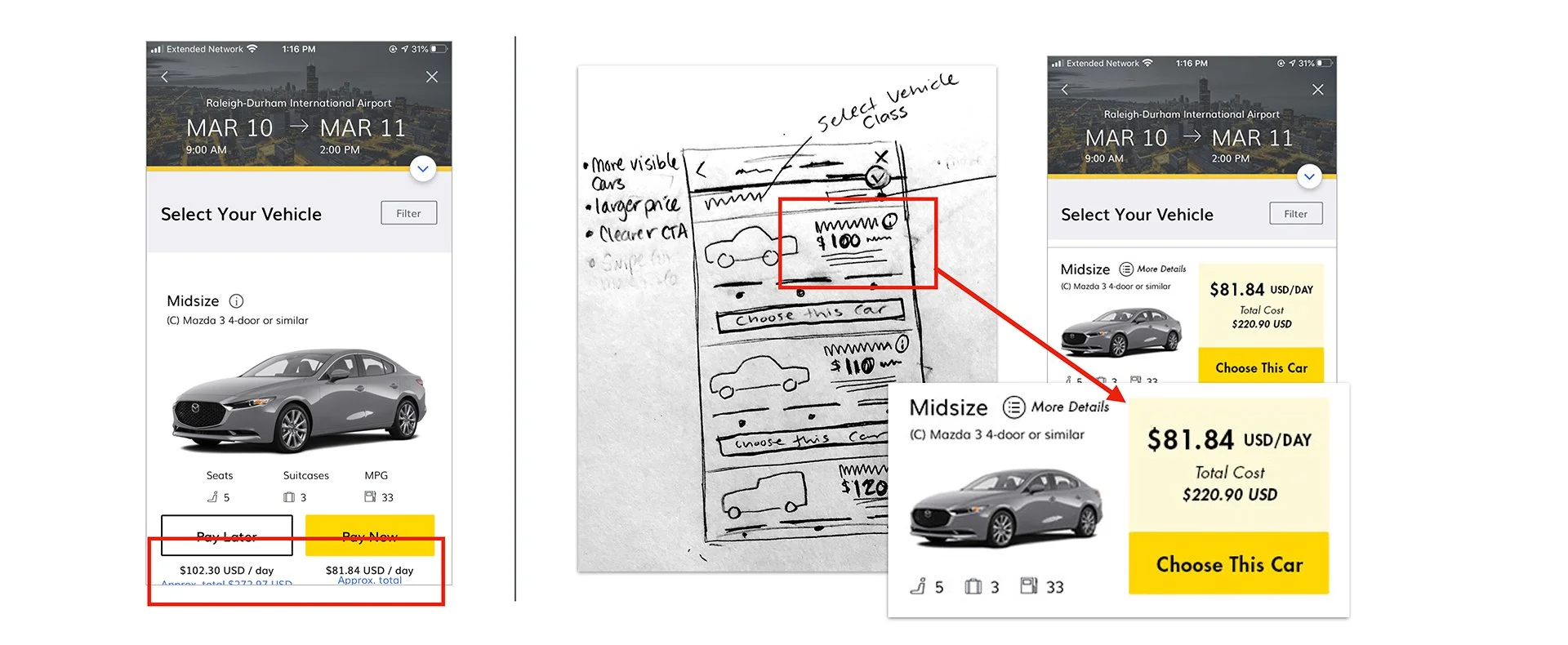
Cost of rental not prominent
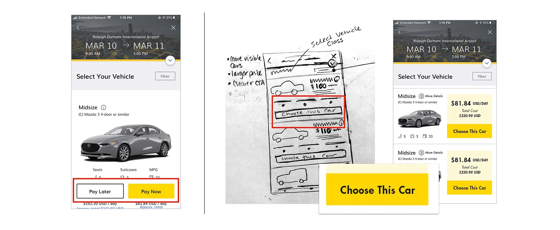
“Pay Now” vs. “Pay Later” buttons can be confusing for users
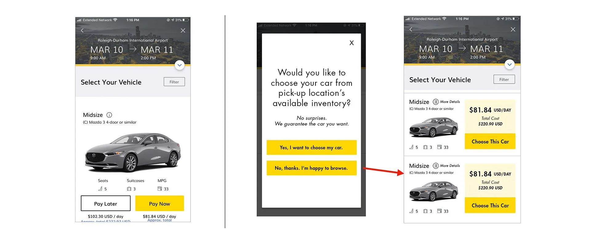
Know the actual car they will be driving
Improvement areasMake “more information” button more prominent and descriptive.
Prioritize and modify filters.
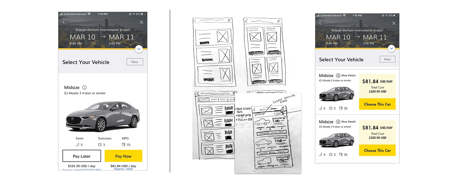
Increase the number of visible vehicles in one screen.
Increase visibility of price.
Consolidate Pay Now and Pay Later Buttons to one call-to-action.
Integrate live inventory.
Action items
Application Iterations
View clickable prototype here.
1. Make “more information” button more prominent and descriptive.
Current AppIterations2. Prioritize and modify filters.
Current AppIterations3. Increase the number of visible vehicles in one screen.
Current AppIterations4. Increase visibility of price.
Current AppIterations5. Consolidate Pay Now and Pay Later Buttons to one call-to-action.
Current AppIterations6. Integrate live inventory.
Current AppIterations
What is next?
Measure updates
Review user survey data
Monitor overall app rating after changes
Review conversion data to determine increase or decrease in overall rentals
A/B test the best classification of cars for vehicle browsing (look for ways to condense when possible)
Considering bringing in big data such as weather forecasting for car suggestions based on driving location - (i.e. suggest 4x4 for snow forecast)

